Case study · Design system
Trailhead
Turning a single-look app into a theme system: tokens, three themes and a Figma file that stays in sync with the code.
Where this started
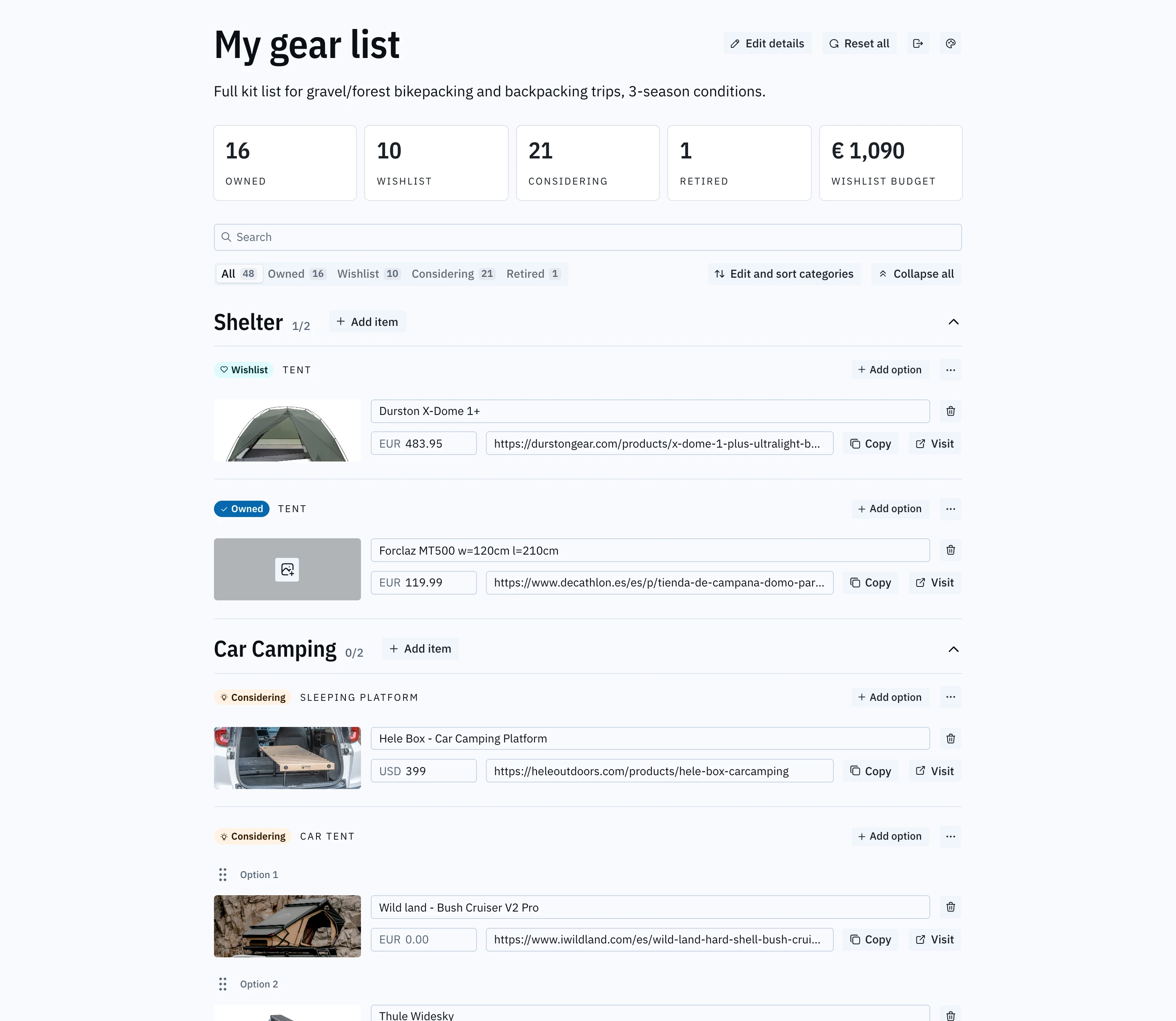
Trailhead is a small app I use to plan gear for bikepacking and backpacking trips: what I own, what I'm considering, what's on the wishlist and what it all costs. I designed it in Figma and built it with Claude Code, one screen at a time.
It shipped with a single look, shadcn's neutral style in light and dark. That was fine for the app, but I wanted to use it for something else: understanding design tokens properly, not from a diagram but in a product I actually use.
The question
Most theming examples swap a color palette and stop there. I wanted to know how far tokens could go in a real codebase. Could a theme also change the typefaces, the type scale, the corner radius, the density and the icons? And could Figma and the code stay one system, instead of two that slowly drift apart?
I set three constraints before starting:
Cleaning up before theming
A theme can only change what's been turned into a token. The first audit found around 30 hardcoded font sizes, fixed widths, a few raw colors and some hand-built controls. Any of these would have quietly ignored a theme.
So the first phase added nothing visible. I replaced pixel values with named type roles (display, headline, title, lead, label, overline) and layout tokens, and swapped the hand-built controls for shadcn components.
To prove nothing moved, we recorded the computed style and position of every element on the page, about 1,600 of them, before the cleanup and after. They matched. That snapshot became the safety net for every later phase.
Three layers of tokens
The structure I settled on is simple:
Primitives
Raw colors likemoss-700. Components never use them directly.Semantic tokens
What something is, likeprimary, radius or font-heading. Each theme is one file that answers “what is primary here?”Component tokens
Only where one component owns a size, like an image thumbnail.Components only ask for meaning: bg-primary, rounded-lg, text-title. That one rule is what makes everything else possible.
Designing three themes
I wanted three themes that feel different, not three color swaps.



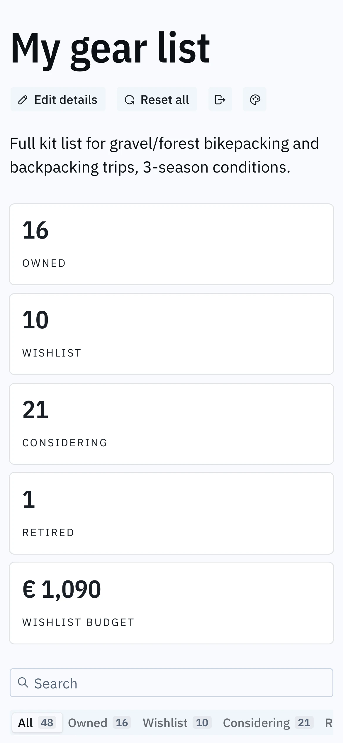
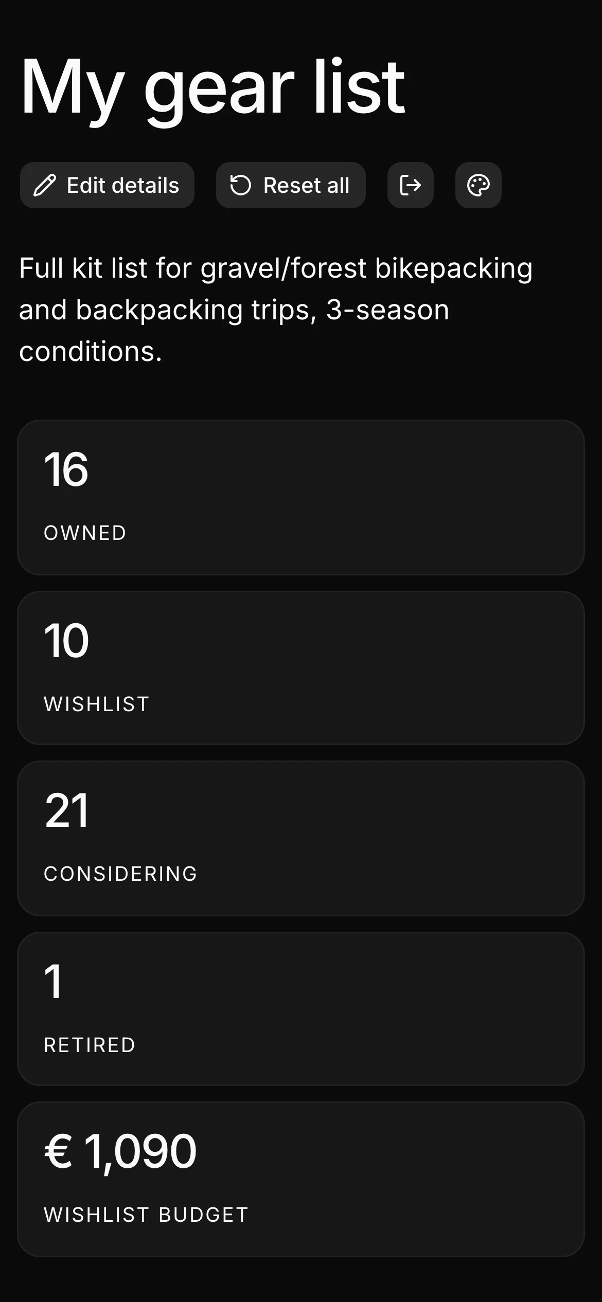
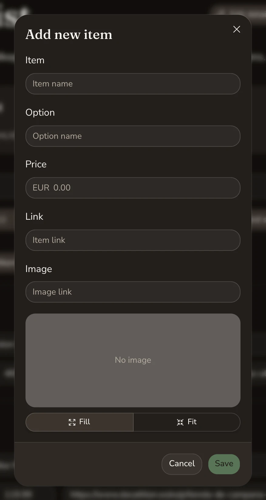
| Property | Default | Trail | Alpine |
|---|---|---|---|
| Mood | Neutral, minimal | Earthy, warm, roomy | Cool, crisp, technical |
| Color | shadcn neutral | Sand, forest green, terracotta | Slate, glacier blue, icy teal |
| Type | Inter | Fraunces + Nunito Sans | IBM Plex Sans Condensed + Plex Sans |
| Corners | 10px | 16px | 4px |
| Density | Base | 10% more space | 10% less space |
| Icons | Lucide | Phosphor | Tabler |
The status badges (Owned Wishlist Considering Retired) got their own tokens. In Default they point back to the original colors, so nothing changed there. In Trail and Alpine each status has its own hue, which makes a long list much easier to scan.
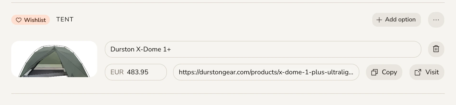
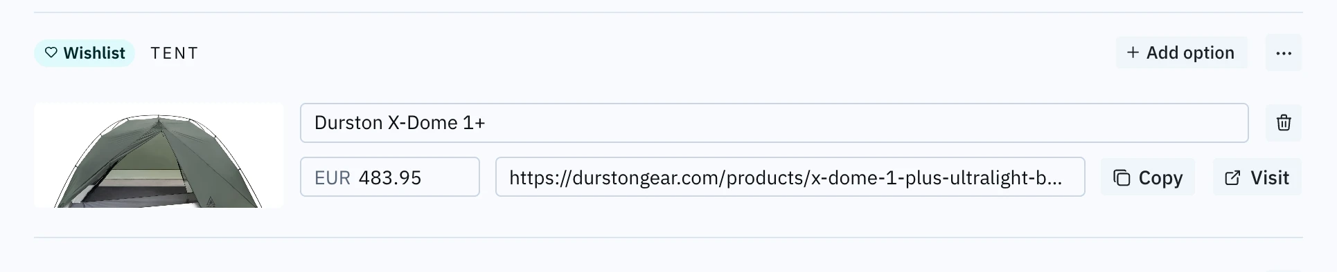
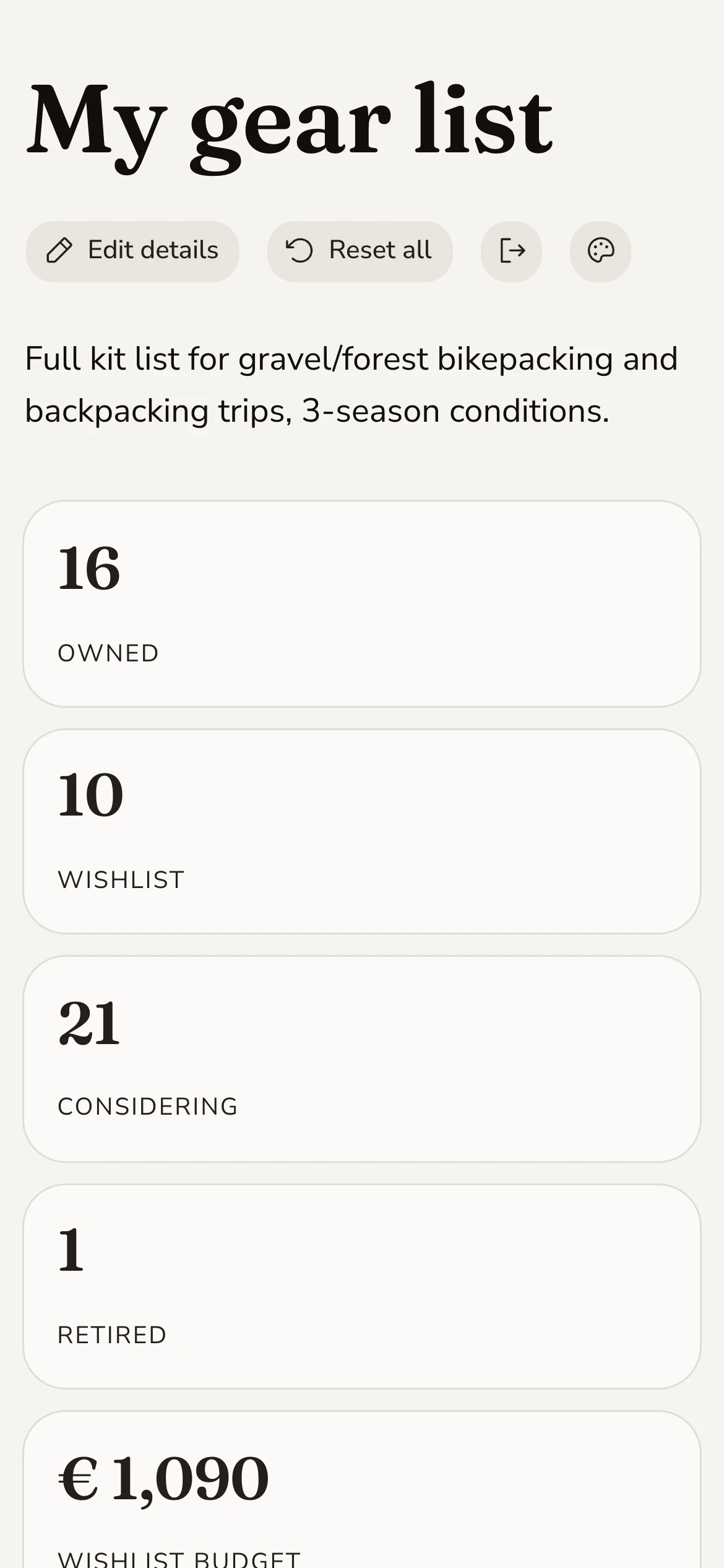
Density turned out to be the most interesting lever, and the most dangerous. One spacing value scales everything, components and page layout alike. It makes Trail feel genuinely relaxed and Alpine efficient. It also pushed Trail's header off a phone screen and wrapped a stat label onto two lines, both of which I had to design around.
Theme and mode are two separate choices
Light/dark and the theme are independent, in the code and in the interface. My first version added a theme button next to the existing sun/moon toggle. On mobile that pushed the toggle onto its own line, and it looked broken.
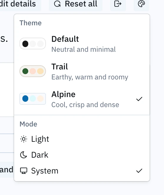
Instead of squeezing the layout, I merged both into one Appearance menu: a Theme section with live previews and a Mode section with Light, Dark and System. The header went back to four buttons, and System mode came for free. It meant replacing the toggle from my original Figma design, which felt like the right trade.
The swatches in that menu aren't a hand-made list of colors. Each one renders with its theme's real tokens, so it can't drift out of date.
Icons as tokens
Colors switch through CSS. Icons are components, so a stylesheet can't change them. I applied the same token idea anyway: components ask for an icon by meaning, like delete or status-wishlist, and each theme maps the 33 meanings to its own library.
This exposed a problem. If only the browser knew the saved theme, the page would load with the default icons and then visibly swap them. Claude suggested moving the saved choice from browser storage to a cookie, so the server knows the theme and sends the right icons in the first response. It's still saved per device, and it cost nothing here because the app already reads cookies for login. On a mostly static site it would have been a harder call.
Contrast as a build step
Tuning colors by eye across six combinations isn't reliable. So we wrote a check that rebuilds every theme in both modes from the token files and tests 25 color pairs the interface actually uses, 150 checks in total. Before trusting it, we compared its numbers against what the browser actually paints. They matched within 0.03.
The first run found seven near misses. I fixed the five in Trail and Alpine. The other two are in Default, and they're stock shadcn values that are part of my original Figma design. I chose to keep them and list them as documented exceptions rather than hide them or quietly change the baseline.
Figma and code as one system
The CSS is the source of truth, and a script turns it into the Figma variables: primitives, a Theme collection (one mode per theme) and a Color collection (light and dark).
My Figma plan allows four modes per collection, and three themes times two modes is six. The workaround is to give each choice its own collection. The Color collection points into the Theme collection, so any frame in Figma gets the same two switches as the app. We checked 36 sample values across all six combinations against the code. Zero mismatches.
The sync runs both ways, so I can design in Figma. A pull applies only the values I changed in Figma since the last sync, so edits made in code since then aren't overwritten.
Working with AI
I made the design decisions: what each theme should feel like, what to protect, which trade-offs were acceptable. Claude Code did most of the implementation, and was fastest at wide, mechanical changes like replacing 30 font sizes or wiring 33 icons through 18 files.
What surprised me was how much of its value came from verification. It built the tools I wouldn't have written myself: the style snapshot, the contrast check, the Figma comparison. Those caught real problems that never threw an error:
It made its own mistakes too. It once cleared a cache while the dev server was still running, and its first version of the Figma pull would have overwritten values computed in code. Both were caught because the habit we built was simple: every claim gets checked against what the browser or Figma actually renders.
That's the part I'll take into other projects. Working with AI didn't remove the design work. It moved more of my time into deciding and reviewing, and made it cheap to check things I used to just assume.
What I learned about tokens
Not everything that looks like a token is one at runtime.
Colors, radius, spacing and type switch live. The tooling baked shadows and font families into its classes, so they needed an extra layer of variables. Icons needed a layer of their own.A theme is more than a palette.
Type, shape and density did more to make Trail and Alpine feel different than color did.Density is global.
It's convincing, but it reaches into layout. Next time I'd let components and page layout scale separately.Results
- 3 themes × light and dark, switchable at runtime, with no flash on load
- Default unchanged against the original snapshot
- 150 contrast checks passing or documented
- 297 Figma variables generated from the same tokens as the code
- A fourth theme can be added with one command and designed in Figma
Next
- Bind the Figma variables to a component library, so the design file switches themes the way the app does.
- Run the contrast check and token sync automatically on every change.
- Let components and layout have separate density.