Vibe-coding a product from scratch:
a designer's experiment
without the canvas
Ripple is a personal habit tracking web app I built through AI-assisted development, turning a fragmented personal tracking system into a single product I use every day.
Overview
What is Ripple?
For the first time, I could build a real product myself. No engineering background, no team, almost no cost. Just an idea and an AI tool that can write the code.
So I ran an experiment. I gave the AI some direction, the structure and what I wanted, and nothing more. The design choices would be its own.
Ripple is what came out of it. But the real subject of this case study is the question underneath it. How good is AI as a Product Designer, and how the role could evolve?
The Ripple logo, designed by Claude.
The Problem
A spreadsheet that
stopped scaling
I track a lot. Habits, workouts, finances, and a few things I would rather not admit to. For years it all lived in a spreadsheet, and that was a deliberate choice. A spreadsheet gave me flexibility and control. I could add an activity, build a new chart, or change how something was measured in minutes.
That same flexibility is what eventually broke it. The sheet grew organically until it was hard to cross-check anything. Metrics that should have talked to each other lived in separate tabs. The structure that once felt like control started to feel like mess. And none of it worked well on a phone, which is where I needed it sometimes.
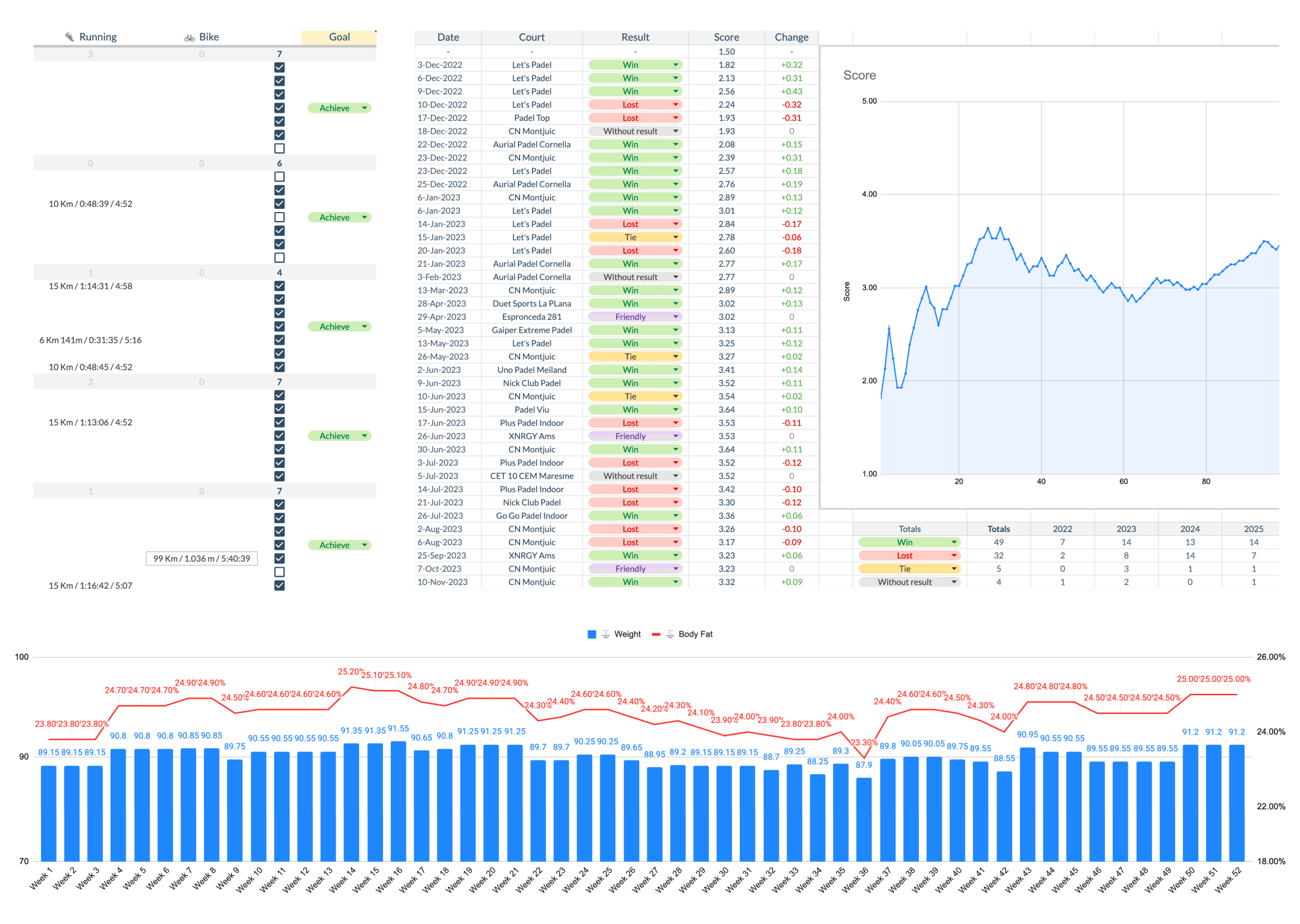
A glance of what my habit spreadsheet looked like.
The Experiment
Testing what AI can
actually do
I did not just want an app. I wanted to understand what this new way of building can and cannot do, because it is going to reshape how designers work. That is why I documented it.
So I set the experiment up as a set of questions:
Can someone with no coding skills build a real product from scratch?
What happens if you skip the canvas entirely and start straight from the AI chat?
And the one I kept coming back to: how good is AI as a product designer?
To get honest answers, I set myself two rules from the start.
Rule 01
Go slow. Understand every decision before moving past it. A slower but better way to learn.
Rule 02
Stay the director. Delegate the tasks, never the direction.
Process
Six steps from
idea to live
Project setup & tech stack
First task: pick the right stack for a web app that works on mobile and desktop. Claude recommended Next.js, Supabase, and Prisma, and explained why each made sense. I followed every step myself and understood each decision before moving on. Slower to build, better to learn.
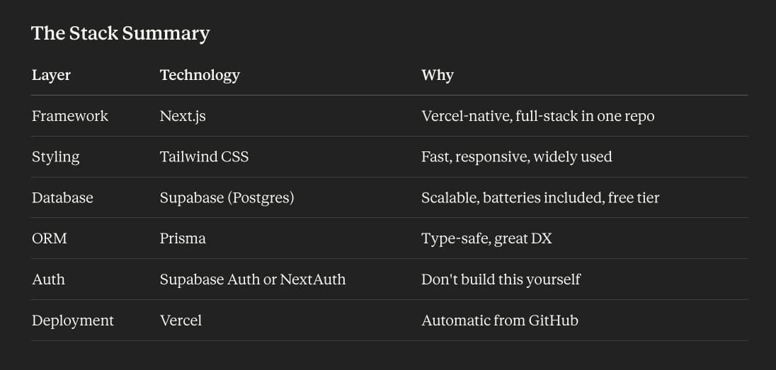
The tech stack Claude suggested.
Data migration
Years of logs sat across Google Sheets, Notion, Strava, and a few other tools, each structured differently. Some exported cleanly to CSV, others needed manual work first. The valuable part was not the migration, it was defining the schema. Working the data model through with Claude became a real collaboration: it asked clarifying questions, flagged inconsistencies, and pushed me to think about how each decision would ripple through the product. That baseline carried everything after it.
Letting go of the canvas
I had always assumed I would design this in Figma. Rough wireframes, then higher fidelity, then hand the specs to the AI to build. The usual process, just with a different collaborator at the end.
Claude had other ideas. Somewhere in the middle it started generating UI on its own. I made a decision on the spot: let it run, see where it lands, then redirect. I fed in some old paper sketches and a general vision as loose direction and let it continue.
What came out was functional. And under the surface, real problems: contrast that would not pass basic accessibility, inconsistencies that only show up when you know what to look for. AI had made decisions a designer never would. Sitting with that was uncomfortable. But I made the call to leave it and focus on functionality first.
That gap, between what AI generates and what a designer would catch, became the question I kept returning to for the rest of the project.
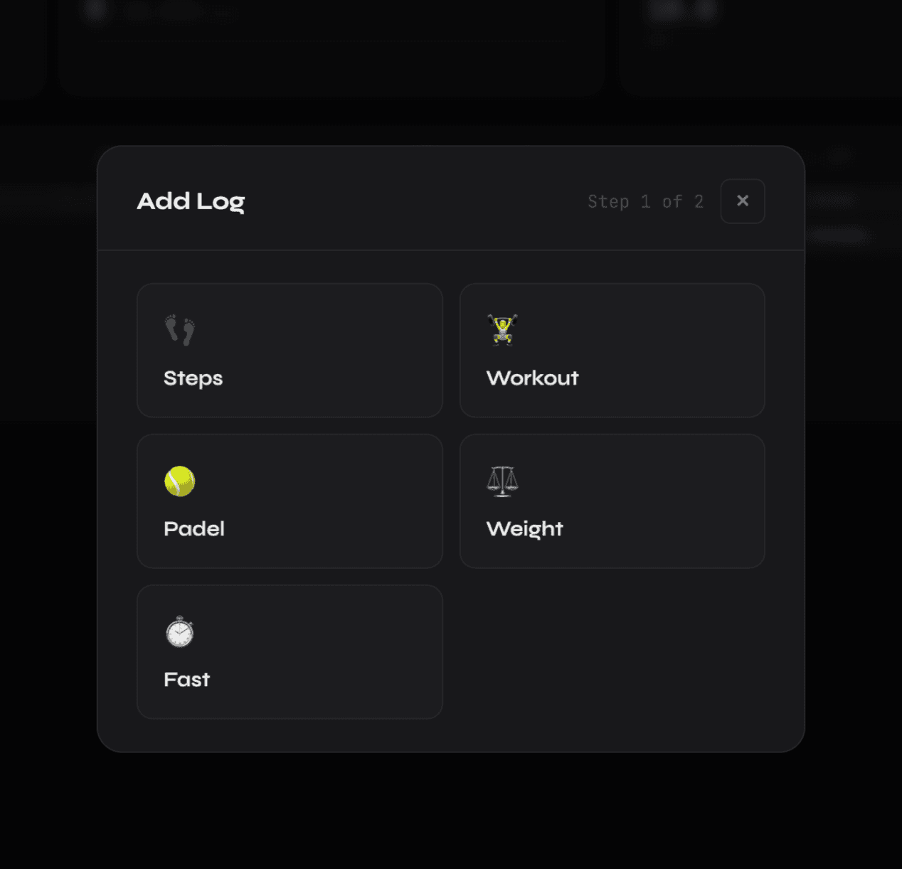
An example of the UI made by Claude.
Dev & demo environments
Every local test was hitting the real database. I flagged it, and Claude suggested mirroring the database for development, plus a demo environment with sample data to share safely. Clean separation early mattered as things got more complex. Was it the right architecture? I could not judge at the time. I followed Claude's lead because I had no technical foundation to challenge it. It worked, but it shows the blind spots that come with building outside your domain.
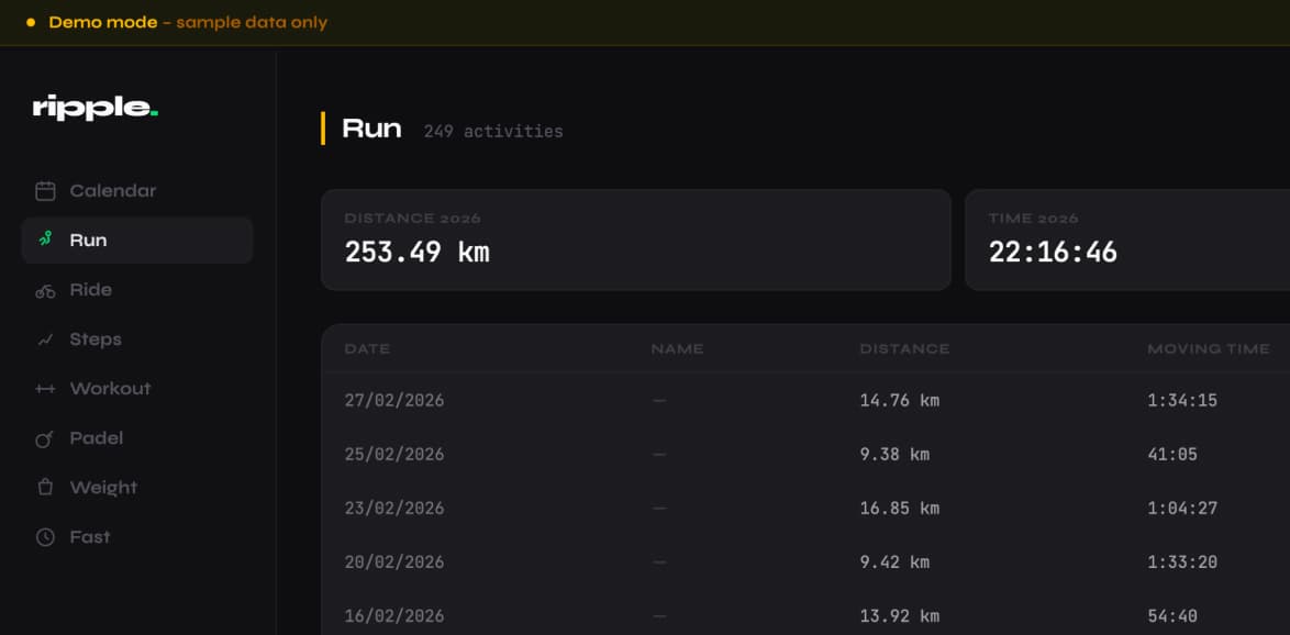
Ripple has a demo version with sample data.
Moving to Claude Code
So far everything had happened in Claude Chat, one long thread starting to show its limits. Context was lost between sessions, uploads repeated. Moving to Claude Code, with direct access to the project folder, solved that immediately. But it cost something. The collaborative planning that defined the Chat sessions did not translate to the terminal. The terminal is powerful, but it does not invite conversation. It executes.
The fix was to keep both. That became the method I will explain in the next section.
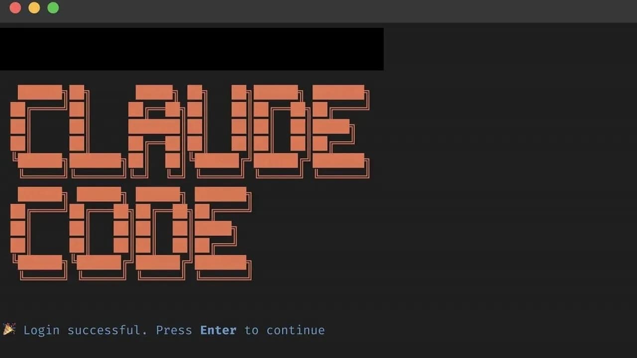
Claude Code in the Terminal.
Strava Integration & Goals Feature
Two features defined the MVP finish line: Strava integration, so workout data flowed in automatically, and goals, so I could set targets per activity and track progress. Bugs came up throughout. Some got resolved through back and forth with the AI, which rarely nailed complex implementations first try. Others I left for a future version. Calling something an MVP means making peace with what it is not yet. That is uncomfortable, but a working product with known limitations beats a perfect one that never ships.
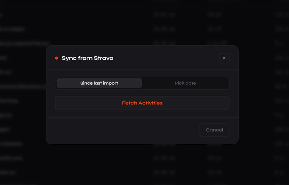
Strava integration feature.
Workflow
The two-mode
method
The biggest discovery was combining two tools so each did what it does best.
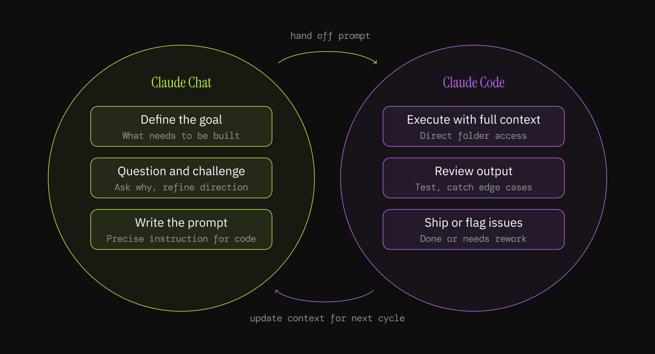
Workflow diagram.
Claude Chat was for planning, direction, and the back and forth good decisions require. Once a direction was clear, Chat wrote the precise prompt for Claude Code, which worked with full project context through direct folder access and a CLAUDE.md file. No lost context, no repeated explanations.
Strategic thinking in one place. Precise execution in another. That combination was the backbone for the rest of the project.
Going back to
the canvas
The UI was always temporary. Functional, but not designed. This was the moment to take it back.
I opened Figma for the first time in the project and did the unglamorous work first. Fixed the inconsistencies and the obvious errors. Raised the contrast and cleaned up accessibility. Sorted out interaction problems and display bugs, like tables that did not hold up. Same UI base, finally held to a standard.
Then the real design work. What the AI had produced was scattered, small decisions pulling in different directions with nothing tying them together. I brought a systems approach, the same thinking a design system provides: spacing, color tokens, components, typography. I took the scattered pieces and gave them one coherent system. That consistency is exactly what AI generation had failed to hold.
To rebuild it I refactored onto shadcn. That gave me a real component foundation, proper theming, and the consistency and speed the original never had.
The workflow evolved too. I designed in Figma and connected Claude through MCP, so the canvas and the code stayed in sync. My two-mode method had started as Chat for thinking and Code for building. This was its next version: the canvas for seeing and deciding, the code for executing.
Here is what I did not expect. Going back to Figma was not only about producing better screens. It gave me visibility of the whole product at once, like finally having a map of the thing I had been building blind. From that map I caught edge cases and errors I had missed, and I spotted improvements and new features I would never have seen inside a chat thread. That, I realised, is what the canvas is actually for. Not drawing rectangles. Seeing the whole, and deciding what matters.
Outcome
A real product,
shipped
2 weeks
from first prompt to live.
7
activity types migrated from Google Sheets, Notion, Strava, and more.
Live
working product deployed in Vercel.
Daily driver since April 2026. Still the first thing I open to log a workout or check a goal, three months on, which no commercial app ever managed for me.
One product instead of scattered tabs. Friendlier UI, faster, clearer data visualisation, and features the spreadsheet never had, like tracking goals per activity.
Scattered to coherent. The refactor replaced AI's inconsistent output with a real system: color and spacing tokens, reusable components, and one consistent experience across every page. It looks and feels like a real product. I built it from scratch.
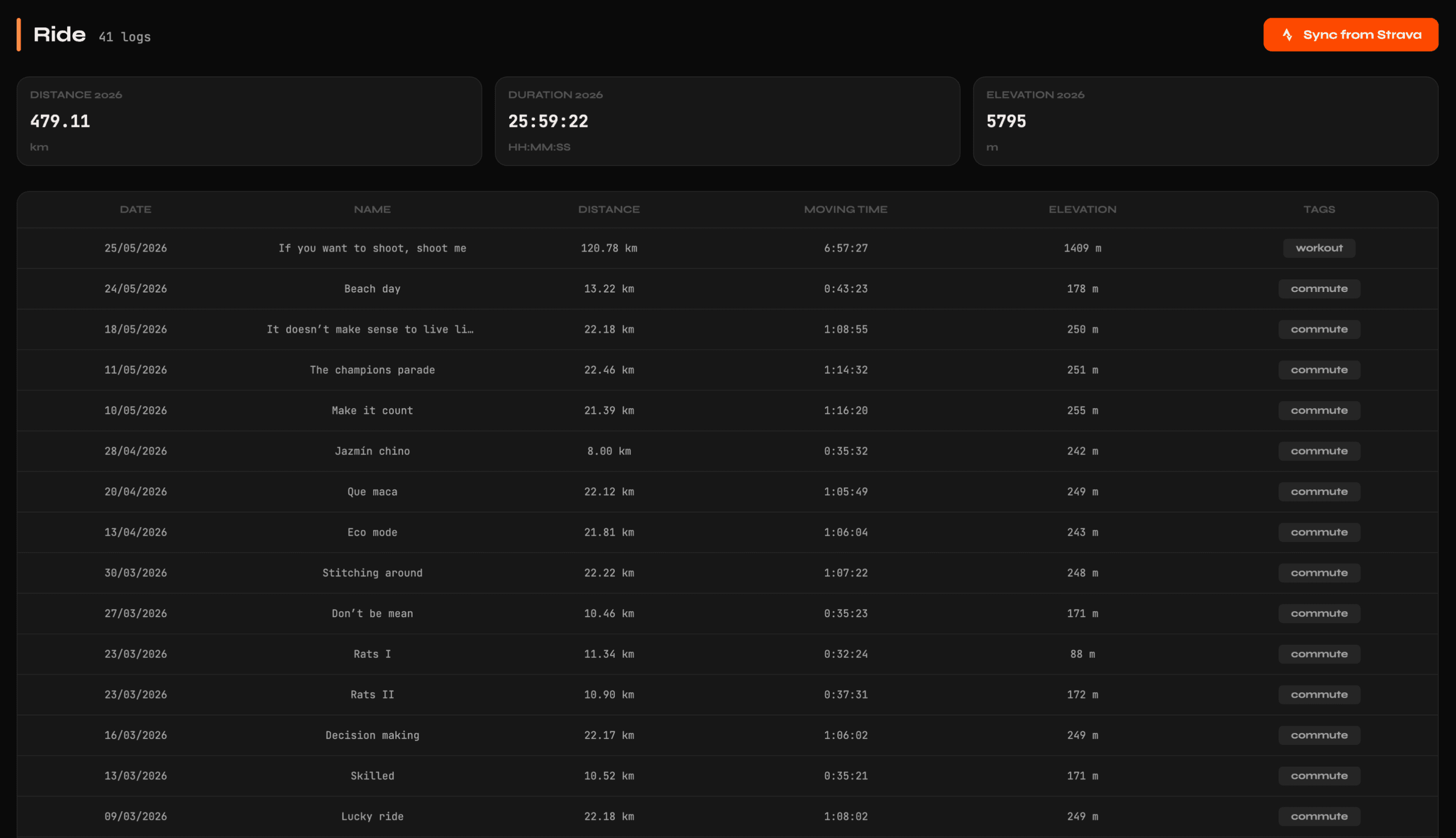
Rides imported into Ripple.
Key Learnings
What this project
actually taught
Orchestrate your tools intentionally
Different AI tools have different strengths. Using them interchangeably gets mediocre results from both. Knowing which to reach for at which moment, and why, is its own skill.
Plan thoroughly, then prompt precisely
AI is most powerful when the direction is already clear. Output quality is directly proportional to the thinking that came before it. Time spent planning is never wasted. Time spent correcting a misguided execution usually is.
Keep your designer eye switched on
AI generates interfaces that look reasonable on the surface and fall apart under scrutiny. Accessibility issues, inconsistent decisions, no coherence across screens. The tools have no taste and no lived experience of using a product under pressure. That judgment still belongs to the designer.
Technical ignorance has a real cost
Not knowing the domain means not knowing which questions to ask or which decisions to challenge. Seek out people with more technical knowledge, involve them early, and never assume an AI recommendation is sound just because it works in the moment.
Reflection
What this means
for design
I started this with a hypothesis: the chat window becomes the new canvas, and design decisions go straight to code. It was a way to move fast, and a way to find the limits by pushing past them.
Here is where I landed instead. AI collapses the cost of building. Anyone with a clear idea and the discipline to direct it can now ship a real product. No team, no budget, no gatekeepers. That part is real, and it is a big deal.
But the UI it generated looked fine and fell apart under a designer's eye. Scattered decisions, inconsistencies, contrast that failed accessibility, no point of view. Functional, not considered. Closing that gap is what sent me back to the canvas, and it is what changed my mind.
The chat doesn't replace the canvas — each does something the other cannot. AI in the chat builds, fast and cheap. The canvas is where you see the whole system and decide what matters.
The conclusion is not that the chat replaces the canvas. It is that each does something the other cannot. AI in the chat builds, fast and cheaply. The canvas is where you see the whole system, hold it to a standard, and decide what matters. AI is remarkable, but it is not there yet as a product designer. What a designer still delivers, judgment, taste, a point of view, the human sense of what something feels like to use, is not a nice-to-have. As building gets cheaper and interfaces get generated on demand, that is the part that gets more valuable, not less.